Web Booker 📅
UX Revamp
UI Revamp
Interactive Design
Context
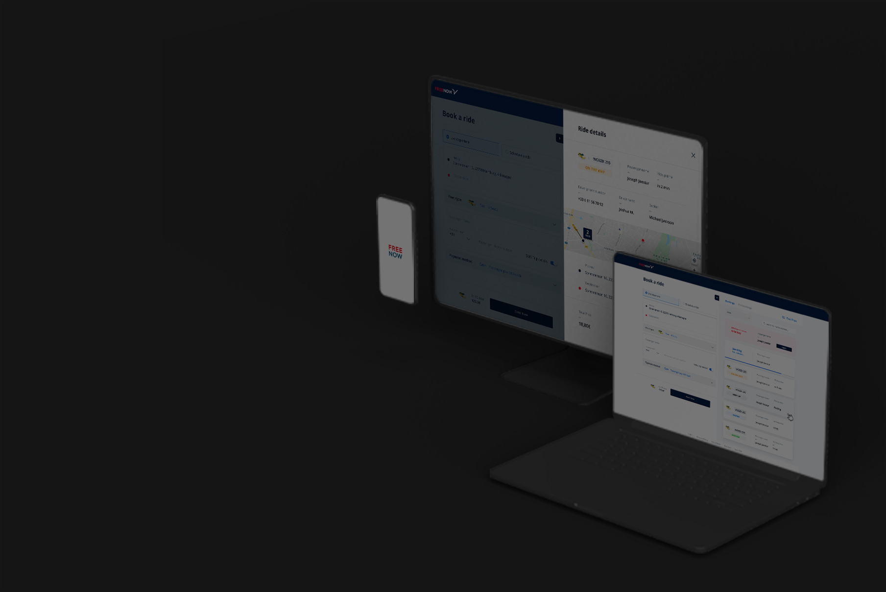
As a Product Designer at Kapten, with Product Managers, Designers and Devs we decided to improved the actual « web booker » feature of Free Now. (A German Company that bought Kapten’s market shares). This tool is massively used by hospitalities or company owners to order rides for their customers or employees.
Audit
The first step of the project was to analyzed the platform, so I started making a UX/UI Audit to identify bad and strong points. I deduced that the actual interface presented many mistakes : incoherent UI components, content hierarchy was irrelevant, to many info were displayed to the user and the ordering flow could be improved :
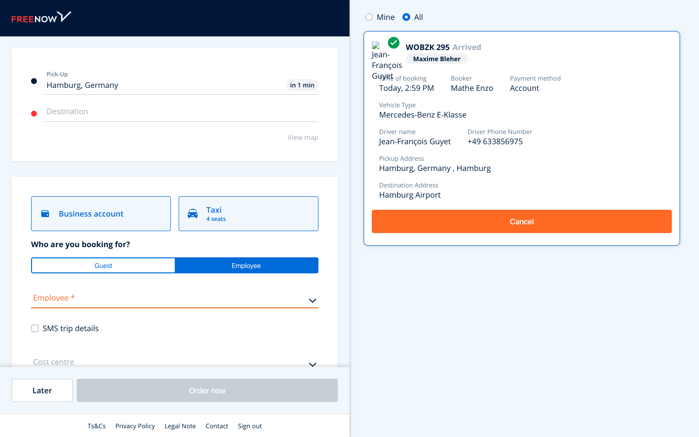
By default, the incomplete inputs was highlight in red, to indicate an error (whereas the user hasn’t already interact with the form)
Main info like ETA and price where a bit to hidden and displayed in inconvenient zones (Pickup and Destination inputs in this case)
The main « Order » features was accessible in a CTA, that didn’t look like a real CTA.
On the right side, users are informed about the different status of their rides, but the component displayed to many useless datas.
Finally, the way used to select the fleet type and the payment methods required to many clicks to the users.
Solutions
To optimized all I previously identify, I redesigned the all order form.
I used more adapted components to reduce the amount of clicks on the order flow
I sequenced inputs according to their importance
Centralized essential info in a fix bar like ETA, price, fleet type and the « order » CTA
Old vs new component


After analyses with PM and UX Researchers, we deduced that the platform was used by many different types of people and there were lots of various ways to use this booker. So we decided to use a « Modular » approach that :
Reduced user’s cognitive charge
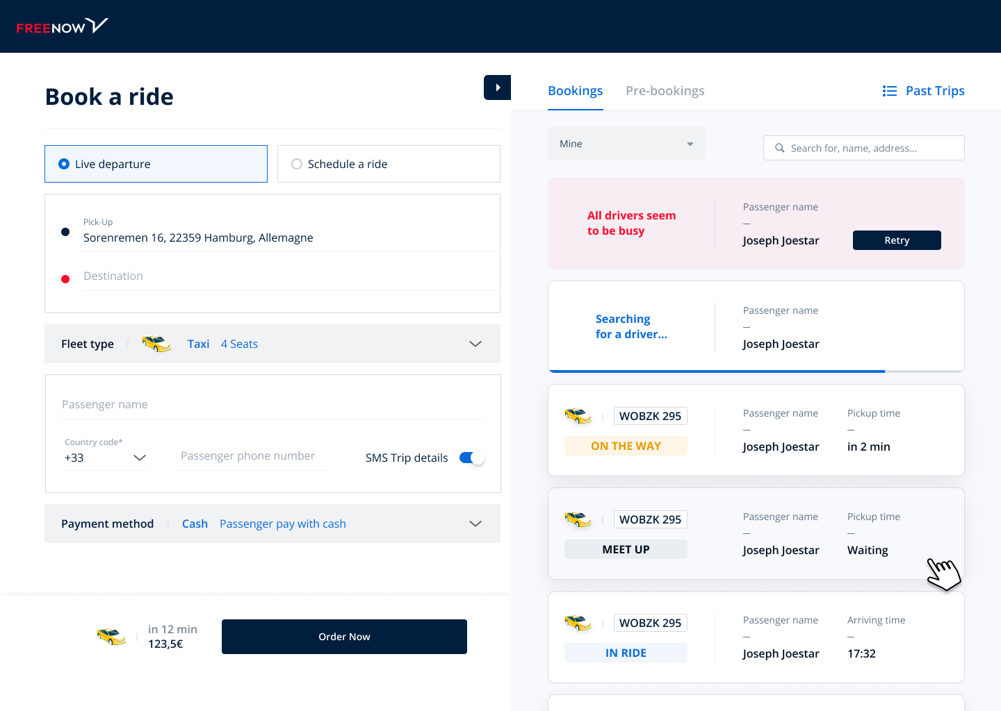
Enable users to display content they need, thanks to a wrapable pannel
Form only
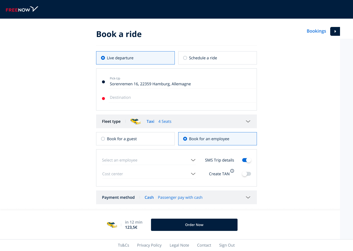
Unwrap pannel
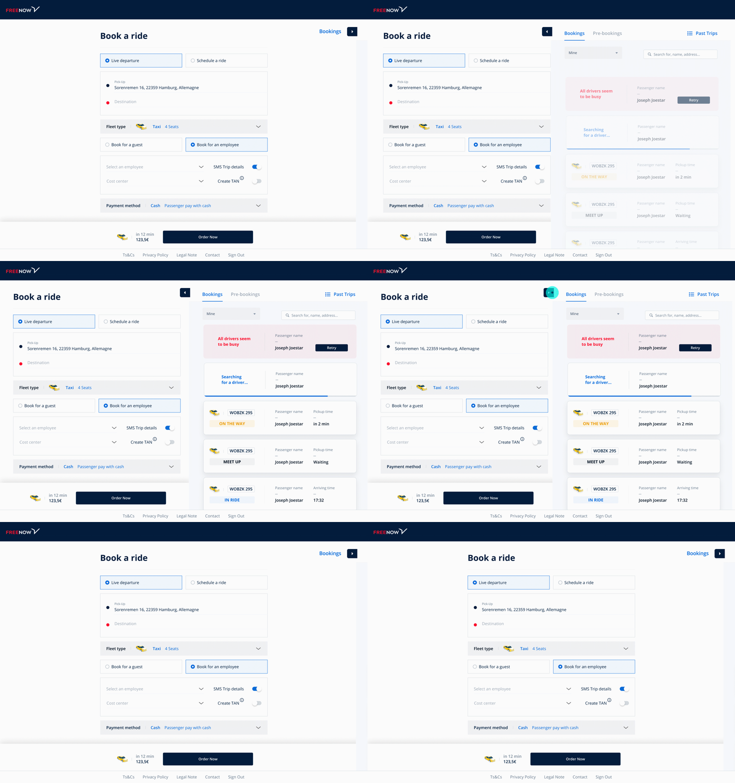
Demo.
Tools
Figma
After Effects

